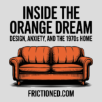
Walking Into the Orange Dream
Step into a house in the 1970s and it feels less like entering a home and more like walking into a controlled hallucination. The carpet is thick and shaggy, swallowing your feet. The couch is burnt orange, low to the ground, and vaguely damp-looking even when it’s dry. The walls glow in shades of harvest gold and avocado green. Somewhere in the background, an appliance hums softly, wrapped in the same warm, autumnal palette. The whole place feels insulated—visually, emotionally, psychologically.
Nothing is subtle. And nothing is accidental.
This wasn’t just a design trend or a collective lapse in taste. The 1970s didn’t decorate with orange—they committed to it. Entire rooms. Entire kitchens. Entire lives wrapped in colors that looked like fallen leaves and campfire embers. The question isn’t why it looks strange now. The real question is why it made so much sense then.
The decade that produced these interiors was tense and exhausted. The optimism of the 1960s had burned off, leaving behind political scandal, economic uncertainty, and a general sense that the future was no longer guaranteed. The world felt unstable. So people did what humans always do when the outside becomes overwhelming: they turned inward.
Homes stopped trying to look futuristic. They stopped pretending to be clean, efficient machines. Instead, they became cocoons. Soft. Warm. Enclosed. Orange wasn’t chosen because it was trendy—it was chosen because it felt safe. Because it looked like heat, soil, sunsets, and food. Because it made rooms feel alive at a time when everything else felt unreliable.
Walking into a 1970s home meant stepping into a designed emotional state. A space built to slow you down, calm you, and convince you—at least for a moment—that things were under control. This article isn’t about bad color choices or nostalgia for shag carpet. It’s about why an entire generation wrapped itself in burnt orange and called it comfort.
The Cultural Mood Shift of the 1970s
By the time the 1970s arrived, the emotional weather had changed. The bright, psychedelic optimism of the 1960s didn’t gently fade out—it collapsed. The promise that love, protest, and collective awakening would fix everything ran headfirst into reality, and reality hit hard.
Vietnam didn’t end cleanly. It dragged on, then left scars. Watergate shattered whatever trust people still had in leadership. The oil crisis made something as basic as fuel feel uncertain, and inflation turned the future into a math problem no one liked solving. The message was clear: progress was not guaranteed, and authority could not be trusted to keep things stable.
This shift bled into everyday life. The future stopped looking shiny and started looking fragile. Instead of imagining moon colonies and utopian cities, people began worrying about energy, resources, and self-reliance. Environmentalism moved from fringe concern to mainstream anxiety. “Back to the land” wasn’t just a slogan—it was a coping strategy. If the system felt shaky, at least nature still made sense.
Design followed mood. The loud, electric colors of the 60s—hot pinks, neon blues, psychedelic clashes—felt naive in a decade defined by limits. They belonged to a time that believed everything would work out. The 70s didn’t believe that. It wanted reassurance, not spectacle.
Earth tones answered that need. Browns, greens, and oranges didn’t point forward; they pointed downward. Toward soil. Toward trees. Toward things that had existed long before politics and would still be there after the headlines changed. These colors grounded people when institutions failed to.
The home became the emotional fallback. Not a showcase. Not a futuristic statement. A shelter. A place designed to absorb stress instead of amplify it. In a decade where the outside world felt increasingly hostile, interiors were tasked with doing something new: making people feel held together.
Why Earth Tones Took Over
Earth tones didn’t take over the 1970s by accident. They arrived because they answered a very specific emotional need. When the world feels loud, fast, and unstable, people don’t reach for sharper stimulation—they reach for things that feel old, familiar, and grounded.
Orange, brown, and avocado green were visual shorthand for nature. Not nature as wilderness or danger, but nature as reassurance. Sunsets. Dirt. Wood. Fallen leaves. Campfires that meant warmth and safety, not survival. These colors carried the promise of stability in a decade that had very little of it.
What mattered wasn’t accuracy. A vinyl couch dyed burnt orange had nothing to do with trees or soil, but it looked like it did. That was enough. The 70s weren’t trying to recreate nature; they were trying to borrow its emotional effect. Earth tones turned synthetic spaces into psychological stand-ins for the outdoors, letting people feel connected without leaving the house.
This was a sharp break from the 1960s. The previous decade loved colors that screamed forward—electric blues, acid pinks, psychedelic clashes that felt experimental and limitless. Those colors celebrated expansion. Earth tones did the opposite. They compressed. They warmed. They enclosed. Instead of asking you to imagine the future, they invited you to sit still.
Burnt orange, in particular, hit a sweet spot. Bright enough to energize a room, muted enough to avoid chaos. It brought warmth without agitation, presence without noise. Paired with browns and greens, it created spaces that felt lived-in rather than staged. Comfortable rather than impressive.
In the 1970s, color stopped being about expression and started being about regulation. Earth tones were chosen because they calmed nerves, slowed movement, and softened edges. They made rooms feel like places where time moved differently. Where the outside world couldn’t quite get in.
Plastics, Shag, and the Synthetic-Nature Paradox
For a decade obsessed with nature, the 1970s relied heavily on materials that were anything but natural. This is where the aesthetic gets interesting—and a little strange. The earthy look of the era wasn’t built from wood and stone so much as from vinyl, plastic, and petrochemical innovation.
This was the moment when mass manufacturing hit full stride. New materials like Formica, molded plastics, and synthetic fabrics made it possible to produce furniture and surfaces cheaply, consistently, and in almost any color imaginable. Designers were no longer constrained by what nature could provide. They could mold curves that didn’t exist in trees, dye fabrics into deep, uniform oranges, and coat entire kitchens in plastic laminates that looked nothing like what they were replacing.
Shag carpet became the symbol of this contradiction. Thick, unruly, and deeply impractical, it turned floors into tactile experiences. Walking barefoot through a shag-covered living room felt indulgent, almost decadent. It absorbed sound. It softened movement. It made rooms feel insulated from the rest of the house—and from the outside world. Cleaning it was a nightmare, but that wasn’t the point. Comfort came first.
Furniture followed the same logic. Couches sat low and wide, wrapped in vinyl or synthetic upholstery, often in burnt orange or rust tones. Chairs curved like blobs instead of standing upright and formal. Everything invited lounging instead of posture. The message was clear: stop performing, start sinking in.
What emerged was a kind of controlled wilderness. Homes looked organic without actually being organic. They felt natural without relying on nature itself. Plastic became the medium through which people simulated warmth, softness, and grounding. It was artificial comfort, but comfort all the same.
This paradox—synthetic materials dressed in earth tones—perfectly captured the 1970s mindset. People wanted the feeling of nature without the risk. The calm of the outdoors without unpredictability. In a world that felt increasingly unstable, plastic made nature manageable. And orange made it feel alive.
The Psychology of Orange
Orange is a strange color to build a decade around. It’s not neutral. It doesn’t disappear into the background. It asks for attention. And yet, in the 1970s, it somehow became comforting instead of overwhelming.
That’s because the version of orange that dominated the era wasn’t bright or electric. It was burnt. Muted. Softened with brown and gold. These deeper shades kept the energy of orange while stripping away its aggression. The result was a color that felt warm without being frantic, stimulating without being sharp.
Psychologically, orange sits in a useful middle space. It carries associations with heat, food, and social closeness. It suggests activity and life, but also safety and familiarity. In small doses, it can energize. In large doses—when toned down—it can wrap a space in a kind of emotional hum. That made it perfect for a decade defined by low-level, constant anxiety.
The 1970s didn’t need excitement. It needed reassurance. The war was over but unresolved. Trust in institutions was fractured. The economy felt unpredictable. Orange didn’t promise a better future. It promised a tolerable present. A place to sit, breathe, and wait things out.
There’s also a subtle denial built into the color’s popularity. Orange says “warmth” even when things aren’t warm. It says “life goes on” without demanding proof. In a house drenched in burnt orange, it was easier to believe that things were holding together, even if they weren’t.
In that sense, orange functioned less as decoration and more as emotional regulation. It softened edges, slowed perception, and made rooms feel alive when the world outside felt drained. The color didn’t solve the decade’s problems. It helped people live with them.
Harvest Gold Kitchens & Total Commitment
Nowhere did the 1970s commit harder to its color philosophy than in the kitchen. This was the control room of the house, the place where modern living was supposed to prove itself. And in the 70s, modern meant harvest gold.
Refrigerators, stoves, dishwashers—everything arrived wrapped in warm metallic yellows and oranges that felt halfway between sunshine and machinery. Avocado green hovered nearby, but harvest gold was the star. These weren’t accent pieces. They were declarations. Buying a gold appliance meant locking in an entire worldview.
The kitchen wasn’t assembled piece by piece. It was curated as a single, unified environment. Countertops matched appliances. Linoleum floors echoed the same palette. Cabinets, backsplashes, and even wall colors fell in line. The goal wasn’t contrast or flexibility. It was coherence. Total commitment.
This matchy-matchy approach wasn’t about subtlety. It was about control. In a decade where so much felt uncertain, the kitchen became a place where everything lined up. Nothing clashed. Nothing surprised you. It projected order, even if that order was purely cosmetic.
That philosophy spilled into the rest of the house. Orange couches paired with orange drapes. Shag rugs matched throw pillows. Bathrooms followed suit, with avocado sinks, tubs, and toilets locked into the same chromatic logic. Once a color was chosen, it took over. The 1970s didn’t hedge. They went all in.
There’s something almost admirable about that level of commitment. No irony. No half-measures. The belief was simple: if everything matches, life might feel manageable. If the space around you looks put together, maybe you are too.
Orange Goes Mainstream
Once orange took hold inside the home, it didn’t stay there. The color spilled outward into culture, becoming one of the most recognizable visual signatures of the 1970s. What started as interior comfort quickly turned into shared identity.
Television cemented the look. Sitcom sets like The Brady Bunch and Three’s Company were drenched in warm earth tones, their living rooms and kitchens echoing what viewers were building in their own homes. These weren’t aspirational spaces in a luxury sense—they were familiar. Watching TV felt like looking into a slightly better-lit version of your own house. Orange became normal through repetition.
Film embraced bold palettes as well. Even when the settings weren’t domestic, color choices leaned warm and heavy, reinforcing the decade’s visual density. The screen rarely felt cool or distant. It glowed. Everything seemed wrapped in the same amber haze.
Fashion followed without hesitation. Bell-bottoms, jumpsuits, knitwear, and leisure suits arrived in rust, gold, and burnt orange. Clothes mirrored interiors: soft, flexible, and designed for movement rather than sharp lines. The body, like the home, was meant to relax into the environment.
Even cars joined in. Streets filled with vehicles painted in saturated oranges and golds, turning daily commutes into moving color fields. Muscle cars and compacts alike wore shades that would feel unthinkable just a decade later. The palette wasn’t confined to private spaces anymore—it was public, mobile, unavoidable.
By the mid-70s, orange wasn’t a choice. It was the background radiation of the decade. A color you absorbed whether you wanted to or not. It unified television, fashion, architecture, and transportation into a single visual language. Warm. Heavy. Impossible to ignore.
The Backlash and Design Amnesia
By the time the 1980s arrived, the orange glow had worn thin. What once felt comforting began to feel suffocating. The warmth that had wrapped the 1970s now read as heaviness, even stagnation. And like most cultural corrections, the backlash came fast and hard.
Design swung in the opposite direction. Earth tones were pushed out in favor of cool pastels, stark whites, and sharp contrasts. Chrome replaced wood. Glass replaced texture. Where the 70s softened edges, the 80s sharpened them. Interiors were suddenly about space, light, and distance instead of enclosure. Comfort gave way to polish.
Shag carpet became a punchline. Harvest gold appliances turned into liabilities, ripped out and replaced as soon as budgets allowed. Entire decades were reduced to before-and-after renovation photos, framed as mistakes to be erased. The message was clear: we don’t live like that anymore.
This wasn’t just about taste. It was about rejecting the emotional posture of the 1970s. The decade had been introspective, cautious, and grounded. The 80s wanted confidence. Speed. Upward motion. Even if that confidence was fragile or borrowed, it looked better on the surface.
What got lost in the process was context. The colors weren’t wrong—they were responsive. They belonged to a moment shaped by limits and uncertainty. But design rarely gets that kind of grace. Once a trend passes, it’s stripped of its reasons and remembered only for its excesses.
That’s design amnesia. We forget why something existed and laugh at the artifact instead. Orange didn’t fail the 1970s. The decade simply outlived the conditions that made it necessary.
The Return of 70s Warmth
Design never really disappears. It waits. And as the emotional conditions of the present begin to rhyme with the past, old aesthetics start to make sense again.
In recent years, the warmth of the 1970s has quietly resurfaced. Earth tones are back, softened and rebranded but instantly recognizable. Burnt orange, rust, ochre, and olive show up in furniture, accent walls, textiles, and lighting. Texture has returned. Curves have replaced sharp corners. Minimalism, once celebrated as clarity, is now often described as cold.
The reasons feel familiar. Economic pressure. Cultural fatigue. Constant information flow. The sense that everything is fast, brittle, and slightly out of control. Once again, people are looking for ways to feel grounded without retreating completely from modern life.
This revival isn’t a direct copy. Today’s version is more restrained, more selective. Orange appears as an accent instead of a takeover. Shag becomes a rug, not a lifestyle. The commitment is lighter, the irony more visible. But the emotional intent hasn’t changed.
What’s returning isn’t the look—it’s the function. Warm colors and tactile materials slow perception. They make spaces feel inhabited instead of staged. They soften the psychological edges of digital life. In a world that lives on screens, texture matters again.
The 1970s understood something that modern design often forgets: homes aren’t just visual environments. They’re emotional systems. And when those systems start to feel strained, warmth finds its way back in.
Why the Orange Decade Still Matters
The 1970s weren’t elegant, restrained, or particularly refined. But they were honest. The design of the decade didn’t try to impress or escape reality—it tried to survive it. Every burnt orange couch and harvest gold appliance carried the same quiet intention: make life feel tolerable when the world feels unstable.
What often gets mocked now wasn’t excess. It was sincerity. The colors were heavy because the mood was heavy. The textures were thick because people needed buffering. The homes of the 70s weren’t trying to look timeless. They were trying to feel livable.
That’s why the decade still matters. It reminds us that design isn’t neutral. Colors regulate emotion. Materials shape behavior. Spaces either calm the nervous system or keep it on edge. The 1970s understood this instinctively, long before words like “wellness” or “regulation” entered everyday language.
In moments of uncertainty, people don’t reach for sleekness. They reach for warmth. For enclosure. For visual cues that say rest is allowed here. That instinct hasn’t changed. Only the aesthetics have.
So when a burnt orange couch or a harvest gold appliance shows up again, it isn’t nostalgia for its own sake. It’s recognition. A quiet admission that comfort matters. That sincerity matters. And that sometimes, wrapping the world in a little extra warmth is the most practical design choice there is.
This piece isn’t just about color and carpet, it feels like stepping inside the psychology of a decade. I never thought about those burnt orange walls and shag floors as emotional architecture before, but now it makes total sense that people wrapped their homes in warmth when the world outside felt unstable. It’s wild how something that now feels dated was once a survival strategy — not just a design choice. Great writing that makes me look at old photos of my parents’ house in a whole new way!
That’s exactly it — those rooms were doing emotional labor.
People weren’t decorating to impress. They were insulating themselves. Thick carpet, low light, warm colors… it was a way to slow the outside world down once you closed the door. The house became a buffer against inflation, bad news, political noise, and the general sense that things were coming unglued.
When we call it “dated” now, we’re really just admitting we’ve forgotten why it existed. That orange wasn’t optimism. It was containment.
If the piece made old family photos feel newly legible, then it did its job. Appreciate you reading it closely.